
Every logo you know by heart was built to tell you a story before you ever read a word. Food brands, especially, play the longest game in visual psychology. They use colour, geometry, and nostalgia to slip meaning into your memory. What looks like a simple wordmark or a splash of colour usually holds layers of design intent—sometimes to make you hungry, sometimes to make you trust them, and sometimes just to keep you looking. Here’s what 15 of the world’s biggest food logos are really saying without saying a thing.
1. Lay’s
The Lay’s logo has always been built around one core idea—warmth. That bright yellow circle at its center represents both the sun and the potato itself, linking nature, freshness, and the comfort of something grown rather than manufactured. The sunlight imagery isn’t accidental; it ties the product back to its agricultural roots and the energy that turns a simple crop into something familiar on kitchen shelves around the world. The red ribbon across the middle adds motion and appetite, acting as both a visual underline and a cue for excitement. Together, the elements tell a story: light, growth, and joy, all wrapped in a design that feels open and optimistic.
In 2024, Lay’s reimagined the logo for the first time in nearly 100 years to make that story even clearer. The new version features stronger rays of sunlight radiating from the background, meant to echo the real light that helps potatoes grow. PepsiCo’s global marketing team described it as a “love letter” to the brand’s origins—a celebration of the potato’s journey from the field to the bag. The update also brought richer yellows, more realistic ingredient imagery, and packaging that highlights the natural sources of flavour. The meaning stayed the same, but the design caught up with it: the sun stands for growth, the potato for authenticity, and the ribbon for the lively, social spirit that has defined the brand for generations.
2. Tostitos

At first glance, Tostitos seems like another playful font. Look closer at the middle. The two “T” letters are actually people, and the dot on the “i” becomes a chip dipping into a salsa bowl. It’s not just clever—it’s brand storytelling condensed into a logo. Sharing food is part of the company’s core identity, so they baked that ritual directly into the design. The subconscious message is clear: you’re not eating alone. Even if you never consciously notice it, your brain already understands that Tostitos equals gathering.
3. Baskin-Robbins
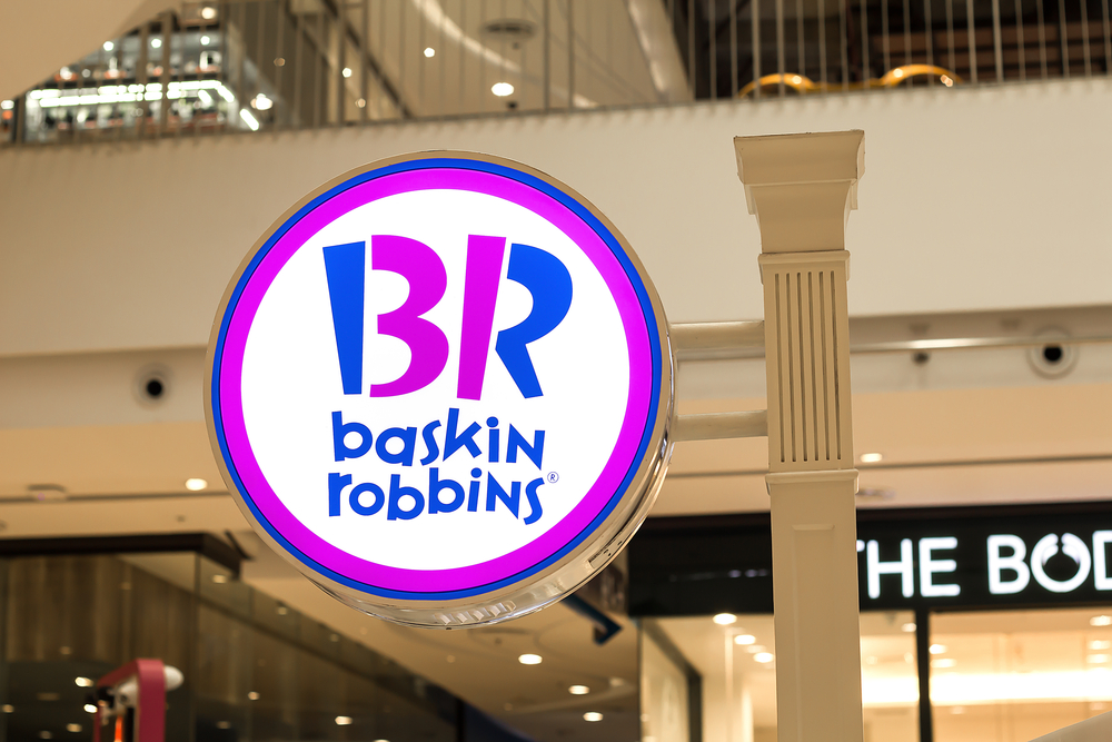
Baskin-Robbins built its logo like a memory trigger. The pink and blue tones hit two emotions at once—fun and comfort. Hidden inside the “BR” is the number 31, a reminder of the brand’s original promise: a flavour for every day of the month. It’s one of those details that sticks, not because it’s flashy, but because it connects to something personal. People see that number and instantly think of childhood, birthdays, and the small thrill of having too many choices. The logo doesn’t just name a brand; it sells the feeling of endless options and the joy of deciding which one’s yours today.
4. McDonald’s
McDonald’s turned an architectural feature into one of the most recognizable symbols on earth. The Golden Arches were once literal arches built into the first restaurants, but now they’re shorthand for consistency, comfort, and something warm to eat when everything else is closed. The “M” shape is obvious, but the real power is psychological. Yellow is tied to optimism and hunger, red is linked to action, and together they create the visual language of fast food. The arches work like a beacon on a highway, promising the same fries and familiarity no matter where you are.
5. Burger King
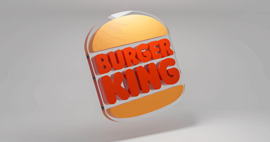
Burger King doesn’t play games with abstraction. Its logo is a direct translation of what it sells, the brand name sandwiched between two buns. It’s simple, bold, and impossible to misinterpret. The orange and deep red tones cue the senses toward warmth and food that feels freshly grilled. When the company returned to this flatter, retro design in 2021, it wasn’t nostalgia for nostalgia’s sake—it was strategy. The older look felt more human, more like food and less like tech packaging. In a market crowded with noise, Burger King decided to be literal again, and it worked.
6. Doritos
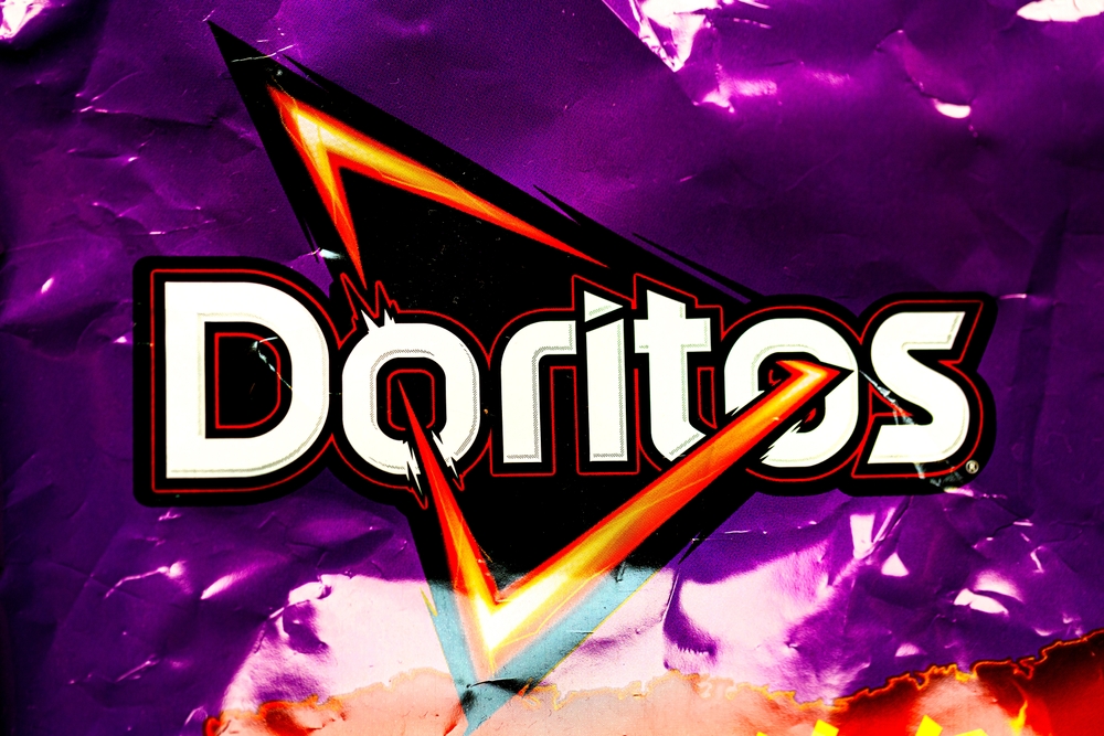
Doritos doesn’t hide its identity. The triangular logo mirrors the shape of the chip itself, an instant cue for recognition even before the name registers. The jagged lines and fiery tones communicate energy and crunch, everything the brand wants you to feel. It’s snack rebellion, designed for motion and mess. The orange glow surrounding the triangle isn’t just a design flourish; it echoes the cheese dust that sticks to your fingers. Doritos is the rare brand that makes chaos its signature.
7. KFC
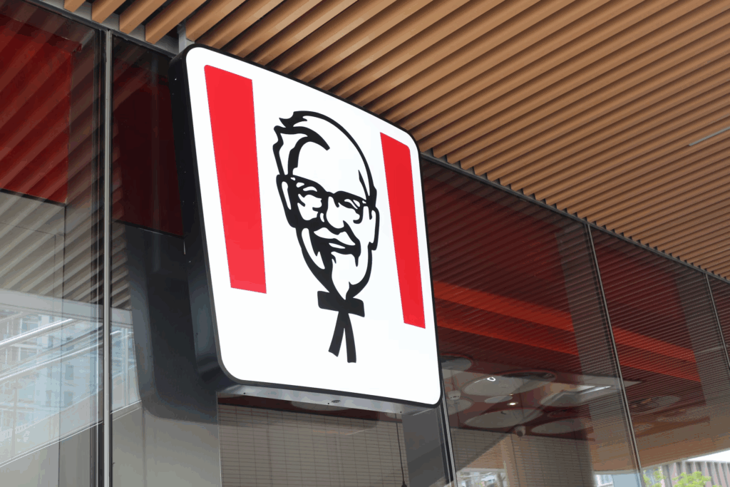
KFC built its identity around a face, and that decision gave it staying power. The Colonel isn’t just a mascot; he’s a symbol of hospitality, routine, and southern roots that feel familiar worldwide. His clean white suit and calm expression make the food feel homemade even when it’s packaged to go. Modern versions of the logo have flattened the lines and brightened the red, but the man remains untouched. The Colonel’s presence reminds people there’s still a human story behind the brand, which is rare in the era of corporate sameness.
8. Dunkin’
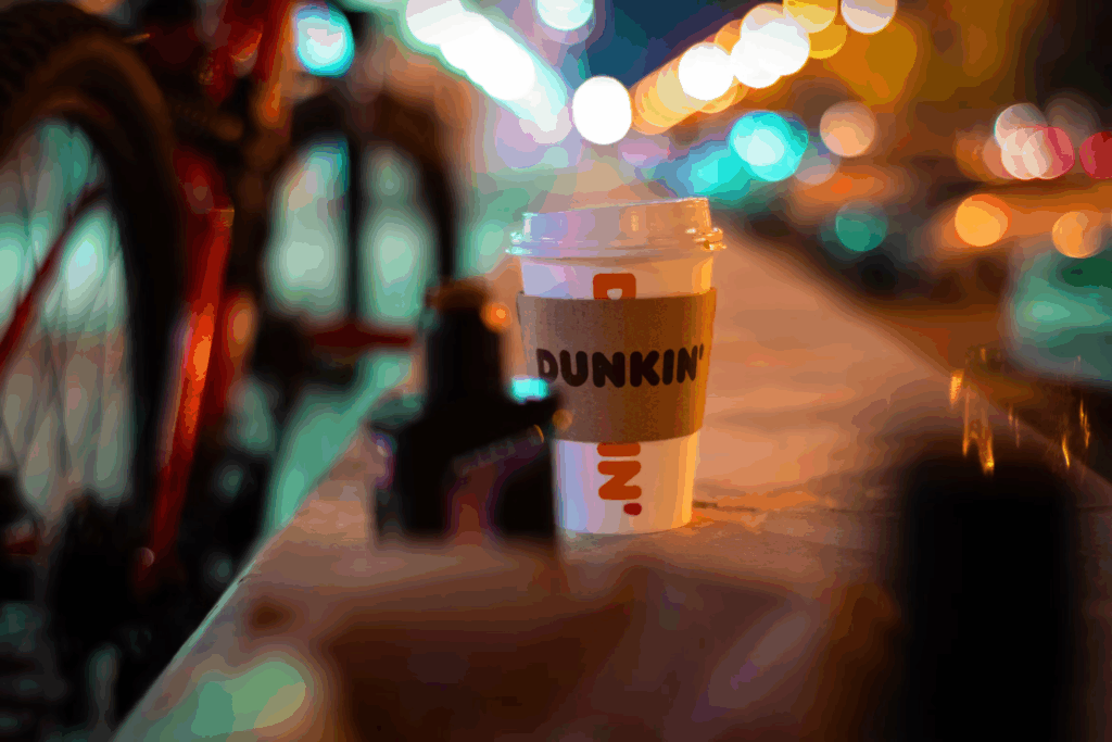
Dunkin’ dropped “Donuts” from its name to evolve without losing its identity. The logo’s round lettering, thick strokes, and energetic orange-and-pink palette make it look approachable yet fast. Every curve invites motion—grab a cup, get on with your day. The choice of colours wasn’t random; orange hits energy, pink hits comfort, and together they make mornings feel slightly less miserable. Dunkin’ doesn’t overthink its image. It’s built for repetition, routine, and a bit of joy before the day starts demanding things from you.
9. Pringles
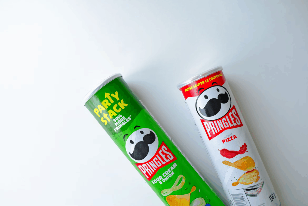
Pringles uses character design as branding science. Mr. P, with his mustache and bowtie, walks the line between playful and polished. His rounded face mirrors the shape of the chips stacked below, connecting mascot and product in a neat loop. When the logo got its most recent refresh, designers simplified his features for clarity on screens, but they kept the warmth that makes him instantly recognizable. He’s not a corporate logo; he’s a snack personality, and that’s exactly why people trust him to deliver that identical crunch every time.
10. Oreo
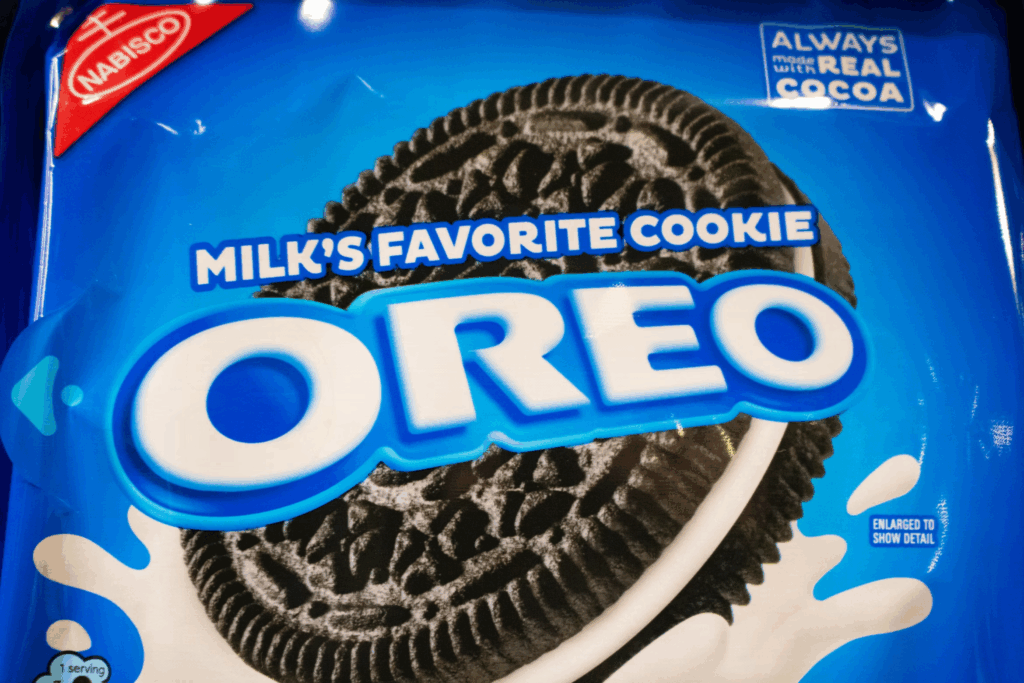
Oreo’s logo works because it feels like the cookie itself. The thick, white lettering centered in a blue circle mirrors the cream between two dark shells. Blue was chosen for its link to trust and nostalgia, both of which pair nicely with milk and childhood memories. Over the years, the typography softened but stayed bold enough to own space on a crowded shelf. Oreo’s design rhythm is circular: unity, togetherness, the act of twisting and sharing. It’s not just a cookie, it’s a ritual—one that the logo captures perfectly without needing to explain a thing. And everyone knows- the best part about the Oreo is the creamy center!
11. Nestlé

Nestlé’s logo doesn’t hide what it’s trying to say. A mother bird feeding her chicks in a nest has been part of the brand since the 1800s, taken straight from founder Henri Nestlé’s family crest. The image works because it captures what the company built its reputation on—nourishment and reliability. Even as the design has been simplified over the years, the meaning stayed steady. The nest signals safety and care without needing extra symbolism. It’s one of the few food logos that still tells its story outright instead of chasing sleek, forgettable design trends.
12. Toblerone
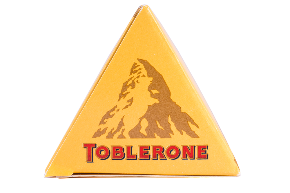
Toblerone’s logo looks like a mountain, but there’s more going on than alpine pride. The triangular peak is modeled after Switzerland’s Matterhorn, tying the chocolate back to its Swiss roots. Hidden within that mountain is the faint outline of a bear, standing on its hind legs. It’s not random—the bear represents the city of Bern, where Toblerone was created, known as the “City of Bears.” The image works on two levels: it celebrates place and heritage while doubling as a clever bit of visual storytelling. The mountain speaks to strength and craft, the bear to tradition and local pride. Together they make the logo feel grounded in origin rather than just shape.
13. Pepsi
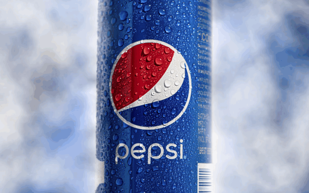
Pepsi’s logo has always been about movement, youth, and staying one step ahead of whatever Coca-Cola is doing. The circular globe—split into red, white, and blue—represents energy and unity, but it also carries a long history of reinvention. Every few years, Pepsi tweaks the curve, shifts the tilt, or refreshes the font, all to stay in rhythm with pop culture. The 1990s were the peak of that strategy, when ads featured stars like Britney Spears, Cindy Crawford, and Michael Jackson, turning soda into a symbol of youth and celebrity. Back then, the logo’s wave seemed to pulse with the music of the decade.
Then came moments that tested that image, like the 2017 Kendall Jenner commercial that tried to link Pepsi to social unity and backfired instantly. The ad’s message felt disconnected, proof that branding about togetherness only works when people actually believe it. Yet, even after the backlash, the logo stayed—and so did the idea behind it. The globe still leans forward, signaling motion and optimism. Pepsi’s symbol remains built on contradiction: always chasing what’s current, yet always familiar. It’s part rebellion, part routine, an icon that survives its missteps because it’s wired to keep evolving with whoever’s holding the can.
14. Orbit Gum
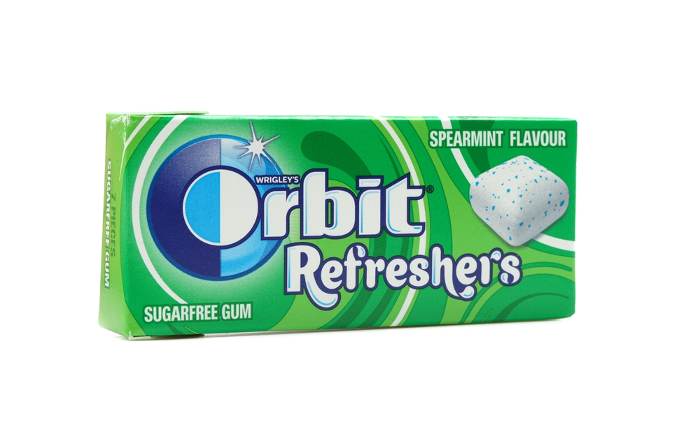
The Orbit Gum logo might look sleek and straightforward, but there’s more design logic hidden in it than most people realize. The logo’s main circle isn’t just decoration—it represents the orbit of a planet, a nod to the name itself. That circular motion suggests freshness that keeps revolving, constantly renewing, the same way gum resets your breath. Inside that circle, the white “O” breaks through a split background of light and dark blue. That contrast is intentional. The darker shade represents the problem—stale breath, heaviness—while the lighter blue and white symbolize clarity and refreshment. The moment the “O” cuts through the middle, it becomes a burst of clean air.
15. And…Drumroll Please- Our Most Interesting Food Logo’s Hidden Meaning: Starbucks
Starbucks built one of the most recognizable symbols in the world, and it started with a myth. The siren—sometimes mistaken for a mermaid—is a twin-tailed creature pulled from a 16th-century Norse woodcut that designers found in a book of maritime illustrations. When the company launched in 1971 at Seattle’s Pike Place Market, its founders—Gordon Bowker, Jerry Baldwin, and Zev Siegl—wanted an emblem that captured the soul of a port city built on trade, travel, and exploration. The siren became the perfect fit: alluring but composed, an echo of old sea stories that promised both adventure and familiarity.

The original logo was far rougher than what you see today. It featured a fully visible siren drawn in dark brown, encircled by the words “Starbucks Coffee, Tea, and Spices.” It looked like something that belonged on a sailor’s crate, not a coffee cup, which was exactly the point. The early design tied the company to its roots as a coffee roaster, not yet the global café chain it would become. When Howard Schultz took over in the 1980s and began transforming Starbucks into a modern coffeehouse, the logo evolved too. The siren was cleaned up, her hair redrawn to cover her chest, and the colour shifted to green—a deliberate move toward freshness, growth, and approachability.
By 1992, the logo had gone through a full redesign, introducing a closer crop of the siren’s face. The typography around her changed from a blocky maritime style to sleeker, more contemporary lettering. Each version kept the myth but refined the execution. The green shade became brighter, the outlines cleaner, and the siren more symmetrical, aligning with the brand’s new global identity. Then in 2011, for Starbucks’ 40th anniversary, the company made its boldest move yet: removing the words entirely. The siren stood alone, surrounded by a green field. No text. No tagline. Just her.

That decision wasn’t design ego—it was brand maturity. Starbucks knew the world already recognized the siren without needing the name. According to chief design officer Terry Davenport, the update was meant to “liberate” the logo and let it represent more than coffee. The siren became the face of everything Starbucks touched—from its coffee pods to its sustainability programs. She wasn’t just a character anymore; she was the brand’s mythology distilled into one image.
Every part of the siren still carries meaning. Her two tails are said to symbolize duality: land and sea, temptation and restraint, tradition and innovation. The green hue signals renewal, growth, and community—the same associations Starbucks builds into its stores with recycled materials, natural lighting, and sustainable sourcing. Her calm, centered expression counters the rush of caffeine culture, giving the sense of pause that Starbucks sells alongside its drinks.
So while most coffee chains rely on cups and slogans, Starbucks has something far stronger—a myth with a pulse. The siren doesn’t need words to tell her story. She’s equal parts history, psychology, and marketing: a sea creature from a centuries-old woodcut turned into a symbol of global ritual.
Why These Logos Still Work
The food logos that have lasted—McDonald’s, Lay’s, Starbucks, Toblerone—aren’t holding on by chance or nostalgia. They succeed because they understand people better than most people understand branding. Strong design doesn’t shout; it stays with you. It sits quietly on a sign or wrapper until your brain connects it to a craving, a smell, or a moment. That’s why those yellow arches can make someone hungry from across a parking lot, or why a green coffee cup feels like a small pause in the middle of a long morning.
Every detail in these designs is there to create a reaction. Circles feel welcoming because the brain reads rounded shapes as safe and familiar. Angled designs, like Doritos’ triangles, communicate action and boldness. Red and yellow increase appetite and speed up decision-making, while cooler tones like green or blue bring in a sense of calm and refreshment. Even fonts carry their own psychology. Rounded lettering signals friendliness, while serif styles project tradition and confidence.

What really keeps these logos alive isn’t just smart design—it’s connection. Food brands have a unique way of syncing with emotion. They don’t show what they make; they show how you want to feel. McDonald’s isn’t simply a fast-food chain; it’s a marker of routine that feels reliable no matter where you are. Lay’s isn’t selling chips as much as comfort. Starbucks isn’t selling caffeine; it’s offering a moment to reset before the next demand. These brands build recognition through feeling, not logic, because no one reaches for a snack by calculating the pros and cons.
There’s also a rhythm to how these visuals evolve. The updates look modern enough to fit on a screen but never stray from what people already know. The Colonel on a KFC bucket has been redrawn over and over, yet his expression still feels familiar. The Toblerone mountain has sharper lines now, but the bear hidden inside hasn’t moved. The Starbucks siren lost her text, but her gaze is the same. Companies understand that progress works best when it keeps a thread of memory intact.
Longevity in design is mostly human psychology in disguise. Food connects to memory faster than logic ever could. It’s the sound of a chip bag opening during a movie, the smell of coffee before the workday, the sweet taste of something familiar when everything else changes. Logos tap directly into that loop. When you see them, you don’t think—you remember. You remember how it tastes, how it feels, and what moment it fits into.
That’s the trick. The best food logos last because they speak a language people already understand. They move with culture but never drift too far from what feels known. In a world that scrolls past everything too fast, these designs remain because they hit where attention can’t fade: emotion, habit, and memory.
Read More: 16 Worst Fast Food Chains to Avoid
Disclaimer: This article was written by the author with the assistance of AI and reviewed by an editor for accuracy and clarity.